
After recording the majority of the shots and adding the track that we had desired we began to edit our footage. During the editing process we had realised that we may have had to make changes to shots that we had already planned within our storyboard, or add entirely new shots that we had not previously considered.

Order of Shots - See Above
- Getting Ready (makeup, getting dressed, the audience see the mask for the first time)
- Location and time change from characters home to an outdoors location
- Car pulls up - both characters journey back to second character's home
- Implied sexual activity
- Implied Violence
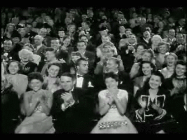
First of all, we knew we had to establish within our product, the film institution that we had chosen to use, which was Hammer Film Productions. This is shown at the beginning of our film opening, as is done traditionally within existing media products. As shown above, the very first visual within our film opening, establishes the film institution that we have chosen to use.

Within the 'Getting Ready' sequence, we colour corrected most of the shots to give a slight tint, as well as to match up the colours between the shots that are supposed to carry on from each other to enhance the continuity between each shot.
This initial sequence was not originally a part of our storyboard, however we decided it would be an effective technique to establish the character of the Temptress.
We also used existing presets within Final Cut Pro X, such as "Romantic", which softens the shot amongst other things. we decided to do this because it gives us the ability to add a tint to create an atmosphere. In addition to this, we also created some of our own presets that would make colour correcting of each individual shot much easier for us to edit.


As shown above, we made use of transitions which is evident within our final product, and both shots and sound have been layered in order to create the desired effect. Sound is discussed in the sound recording post in more detail. This allowed us to create the desired effect of an echo within the soundtrack that we had decided to use. This enabled us to create an eerie atmosphere that would've created uneasiness amongst the audience.
We also used some sound effects that were accessible by FCPX, although these were used minimally. An example of a sound effect that used is shown to the right.
 During the post-production process, we also experimented with transitions to achieve a particular affect, as seen above. We wanted the smoke from the candle being blown out to carry forward onto a black screen for a brief moment, before the location changes to signify the significance of the next part of the sequence. This creates an eerie and mysterious atmosphere which causes the audience to contemplate the narrative of the film opening, as at this point they know very little information about characters within the film opening.
Below, are comparisons of our storyboard to the corresponding shots within our film opening. This demonstrates that during the production process we had to make decisions as a group to decide what would be included in our final product.
This sequence was intended to give the character of the Temptress a mysterious vibe, as within our storyboard we did not include the 'Getting Ready' sequence, as aforementioned. The reverse tracking shot was unable to be done due to the busy location surrounding Greenwich Market where we had filmed. Additionally we were not able to create or find a makeshift track for this particular shot.
The final product mimics the storyboard quite accurately, although the order of the shots were changed in order maintain the continuity between the shots within this sequence. The Temptress is represented and established as a highly feminine character. We did not include a long shot of the characters' interaction as we did not want to create a personality for the character for the victim. We intended to represent him as a stereotypical hypersexual male who seeks sex workers for their services.
Again, this shot is how we had planned for it to be. It was intended to show the journey to the victim's residence.
The purpose of this shot was to reflect the nature of the relationship between the two characters. It should have established tat the character of the Temptress is a prostitute who is providing her services to a customer who eventually becomes her victim.
Finally, within these particular shots, the manipulative and murderous nature of the Temptress is revealed to the audience. The low angle shot indicate her dominance and her power in this situation.
 At the very end of our film opening, we added the title of our film opening, on top of a black background and a soft glow of a candle, which is blown out in time with the music as well as the flickering light of the title which also fades out with the music. We chose to do this because we thought it was an ideal point within the soundtrack for us to end our film opening, and we did not have nor need to add more footage, as this would have displaced the already edited footage which was edited in time with our soundtrack.
The ending of our film opening was carried out very much how we had planned it to within our storyboard, as shown by the clip to the left. Although the font we had used within our product was not how we had initially imagined it to look.
- S


